As a frontend developer and designer I often joke that most of my days are spent working on forms – adding form validation, deciding what field types to use, making sure they’re accessible etc. Forms are a crucial point of interaction on the web. They’re so prevalent and contentious that entire books have been written about form design. As such, I decided to explore them as part of my ongoing foray into the fundamentals of UX.
To accomplish this I tried my hand at redesigning a complex app used in real life by law enforcement and government agencies. My goal was to modify the wireframe to eliminate unnecessary interaction wherever possible and make any other beneficial changes.
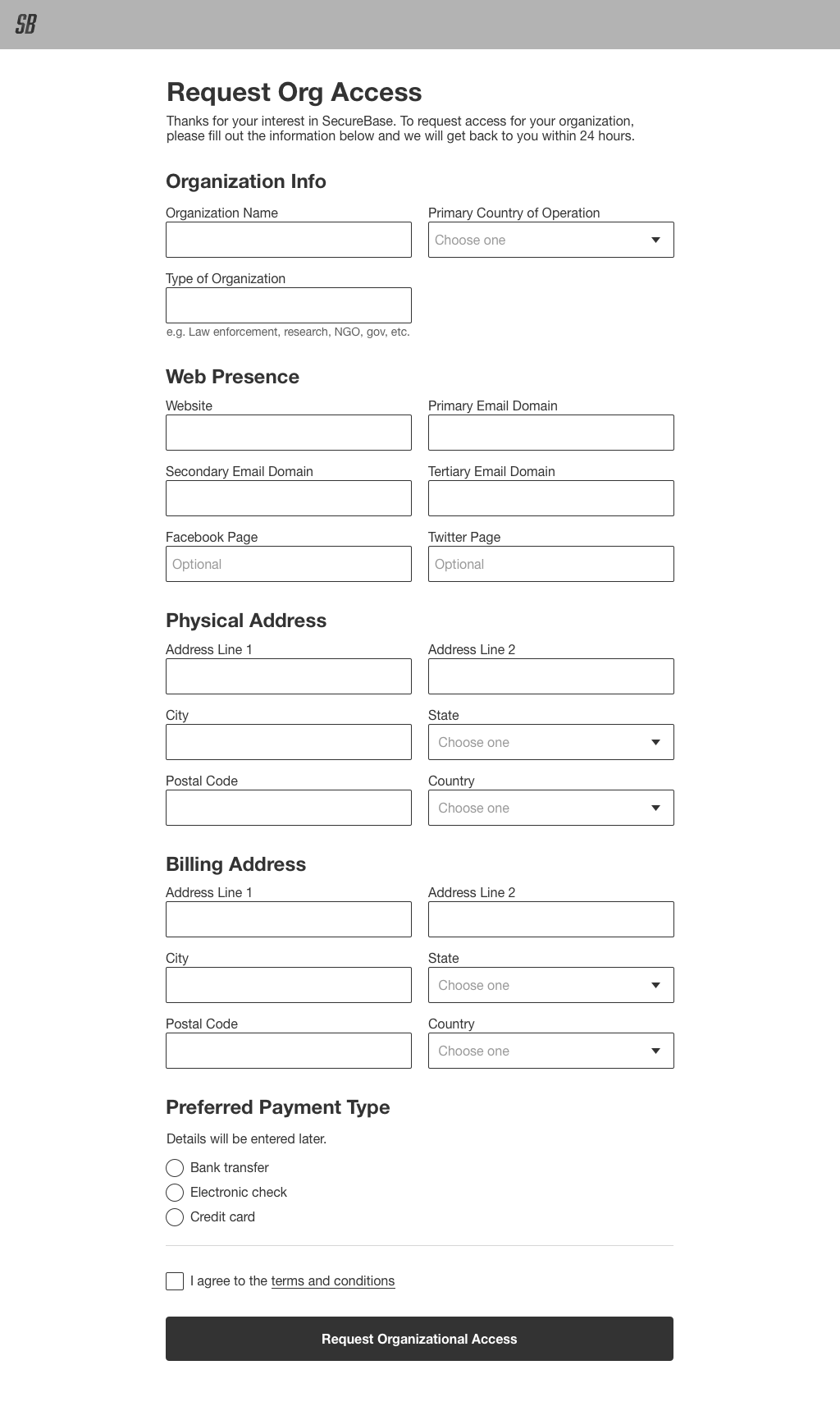
Here’s the initial wireframe:
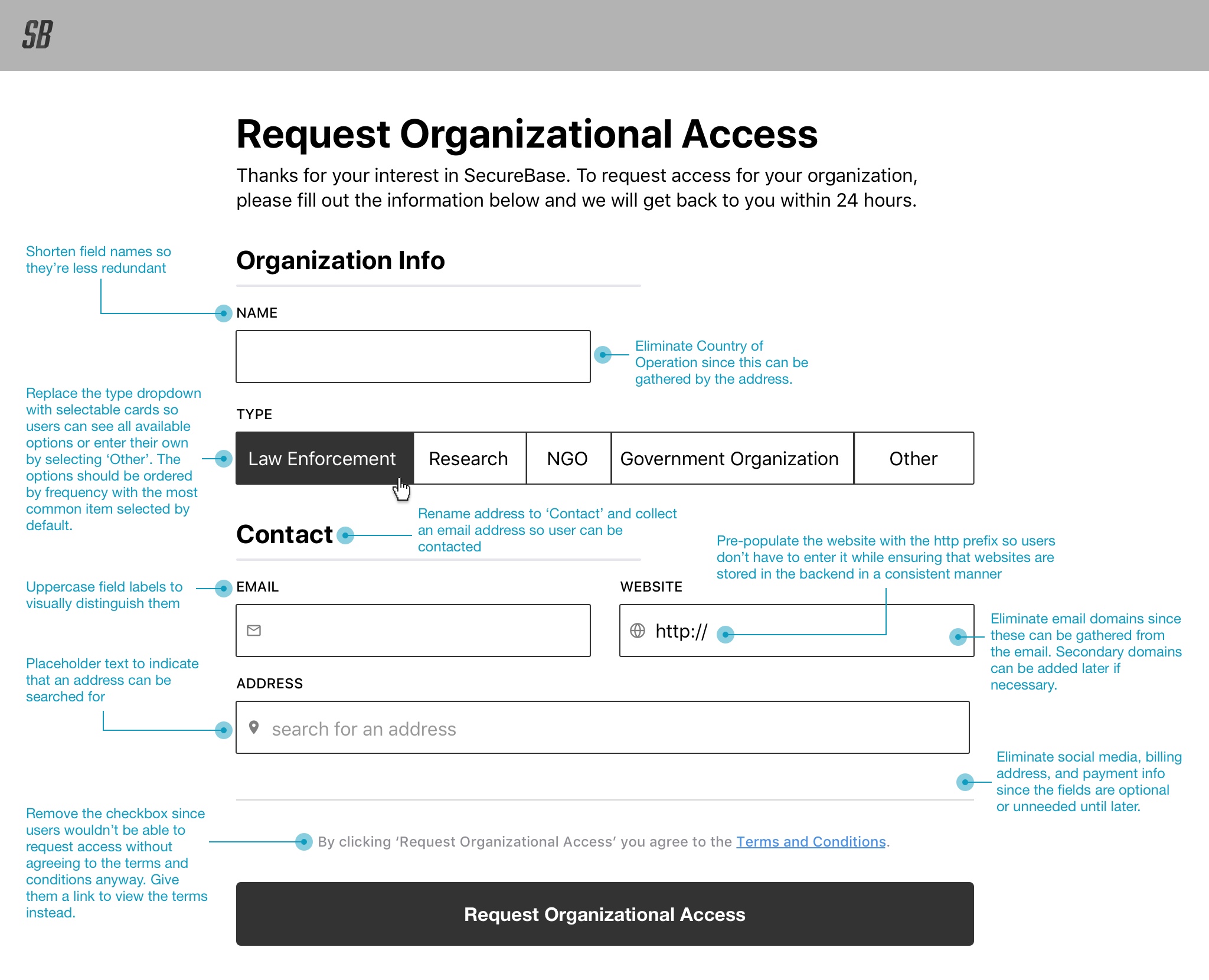
And my solution wireframe with annotations:
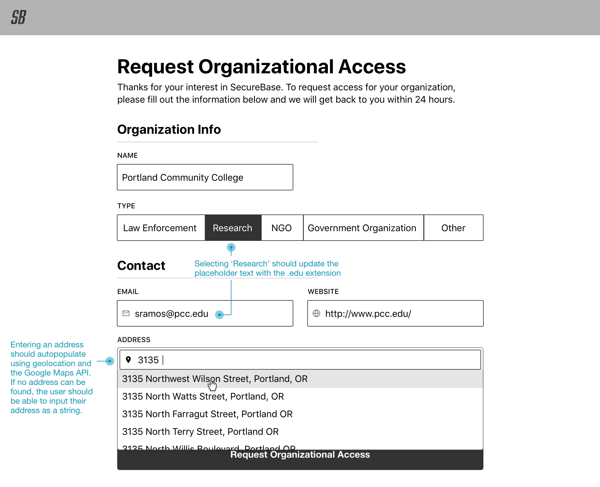
Along with my solution as a Sketch prototype.
Overall, I approached the redesign with Caroline Jarrett’s Question Protocol in mind. A question protocol is a helpful tool for analyzing which form fields are truly required. As you might’ve noticed the biggest problem with the initial wireframe was that it asked for a ton of information, much of which wasn’t actually appropriate to gather at that time. Using a question protocol to identify what was being asked in the form, who needed the answers to the questions, why they needed the answers, and whether the answers were required or optional helped me eliminate redundancy. Getting rid of extra fields and simplifying the form overall helps prevent users from dropping off, and instead brings them closer to their actual goal, which in this case is gaining access to the system.
The trade off of course is that requiring less information up front means potentially more work for the developers – whether it’s by implementing the Google Maps API to look up addresses or by having to build a second form later on to gather additional data. As a UX designer however, our mission is to advocate for the user as much as possible, and in this case the trade off seemed worth it.