In my last post about UX fundamentals I discussed reducing complexity to make forms more usable. This week I explored a second key principle of interaction design: showing only what is actionable. These days when so much of our time is spent interacting with technology, designer Stefan Nikolovski says we can think of navigating interfaces as a “UI commute”. We move across dropdown menus, buttons, and paragraphs, searching for clues that will help us complete our tasks. All of this can take a mental toll on us, causing fatigue, distraction, and information overload. One of the best ways designers can lessen a UI commute is by reducing the amount of information to show only what the user truly needs at the appropriate time. When designing it’s helpful to keep these ideas in mind:
- Ask: what is the user trying to do? What information do they need to do that?
- Make the most useful information related to their task the most visible
To implement this design principle my task this week was to redesign a mobile webpage for a local gym’s class schedule. The site should help users answer the following questions:
- “I want to attend a class today or tomorrow – what’s available and when?”
- “When is such-and-such a class this week?”
- “Is there a class on this date at around this time?”
Here’s the initial problem wireframe.
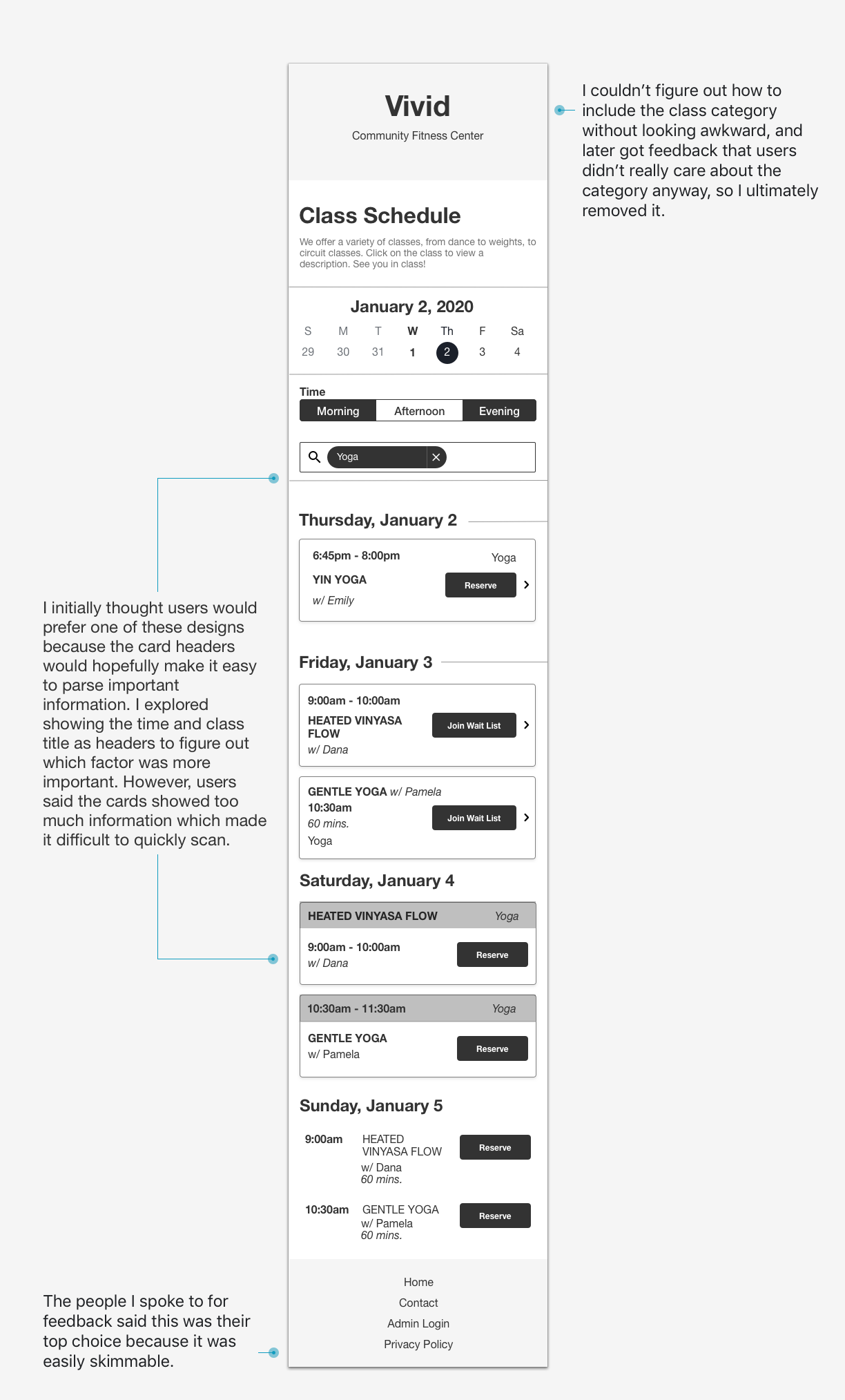
My first pass:

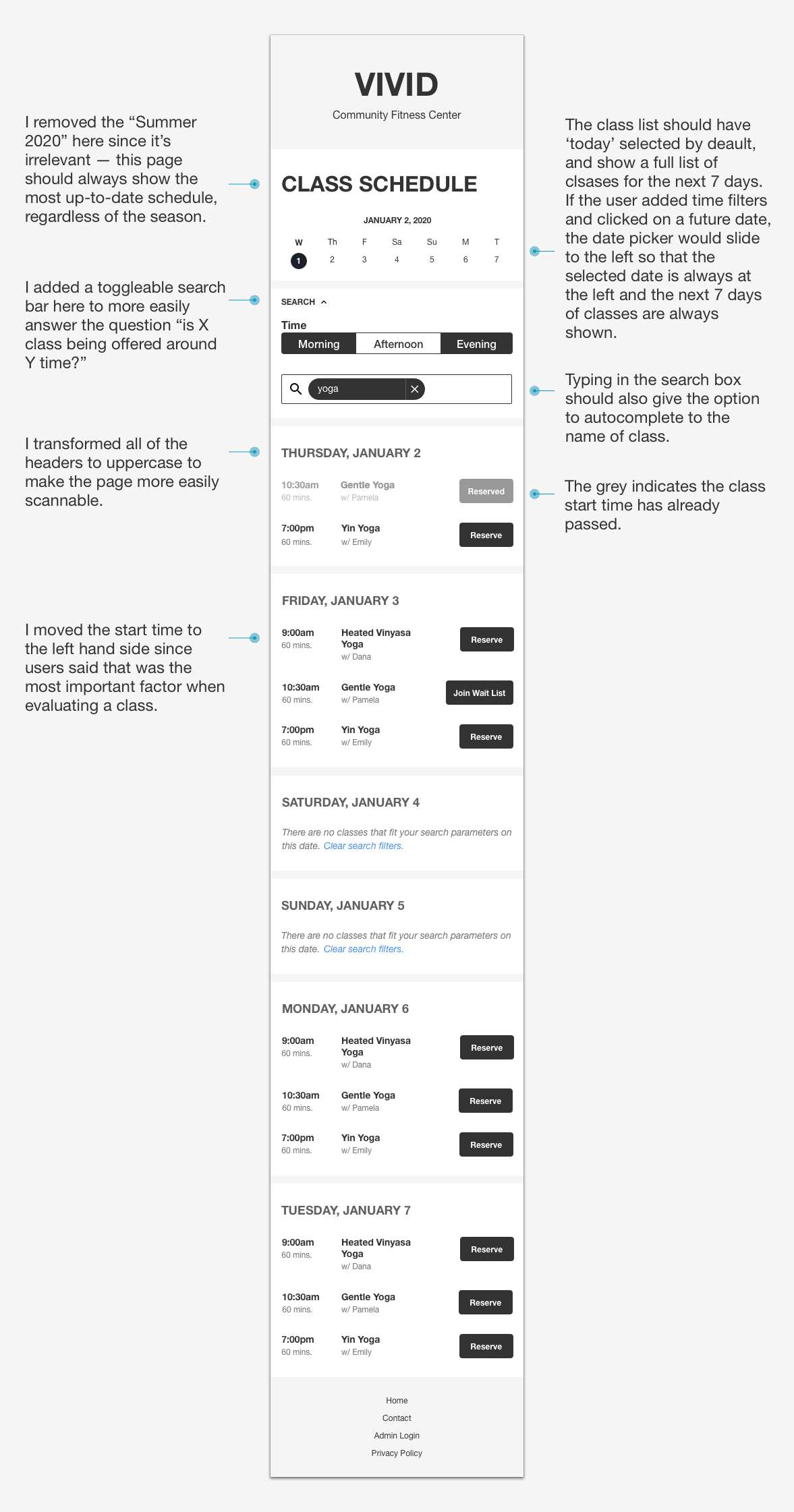
My second pass:

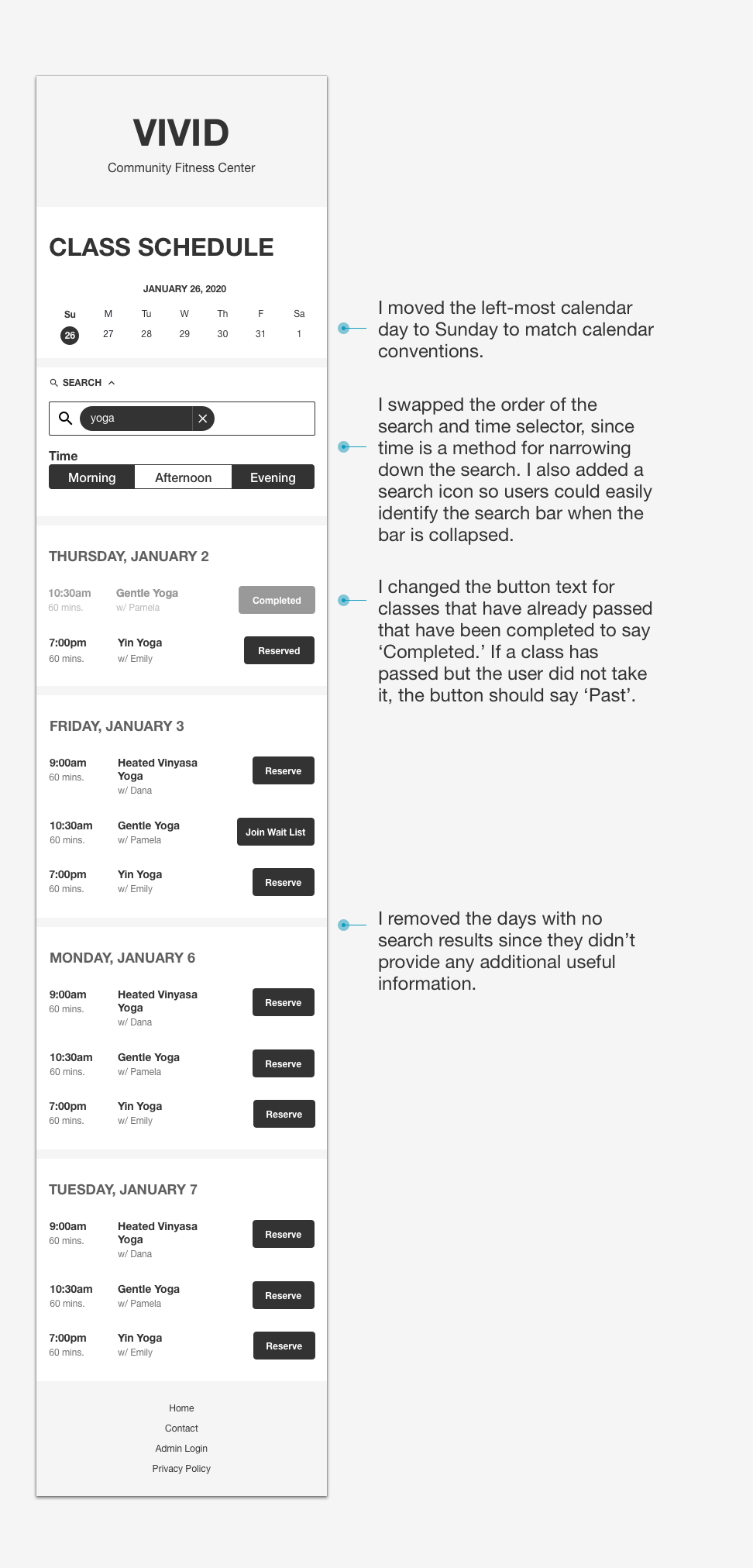
And my third pass at a solution:

My goal here was to make the schedule as skimmable as possible, as users would be glancing at this page from their phone. My first ideas explored various groupings and hierarchies while I tried to maintain the information and functionality I thought would be most crucial to users. However after sharing these designs with 3 potential users, I learned that they didn’t actually care about class descriptions or class category, for instance. My second and third designs took this into account, getting rid of excess borders, text, and improving the page hierarchy by adding consistent spacing and typography. I’m still curious as to whether the course descriptions could be included somehow, perhaps with an expandable toggle, but that’d be something to explore in a future iteration.